P1: Describe an existing media and advertising campaign
Lucozade is a campaign their aims and objectives is to advertise their drink to get more people to drink it. Lucozades aims and objectives have changed over time because the drink used to be a drink used when people where sick as a way to cure sickness and was even sold in chemists.
There target audience was children and people who where sick and one of there key messages was "children need it" this is now known to be unhealthy in many ways and shouldn't really be for kids. Their approach was very simple but persuasive to people and it was often advertised to be consumed in doses like medicines. for example there is an old lucozade ad below that shows what the ads used to be like they where very simple with a picture of the drink a person representing their target audience as well as information about the product.#
lucozade as a whole as a brand had a slogan which was very effect full but very simple which was "lucozade aids recovery" this helped the brand because it was straight to the point of what their product was to be used for.
How ever in the advertisements lucozade has completely re branded and now is branded and advertised as a sport/energy drink it is no longer consumed in doses and their target audience is young people and sports athletes.
The adverts now are aimed at young people because is often features popular trends physical activity and comedy this is to make it look better so more people will buy it they often also use colourful advertisements which matches the drink because the drinks are also very colourful. Lucozade's aims and objectives are to be the biggest sport and energy drink in the extreme sports scene they do this by not only making drinks but using their target audience to advertise with things such as bottles with their logo to make their brand more known not only by people who play sports but also people who watch sports because they have 2 versions of their drink.
Below is an example of their energy drink line you can see it is very colourful and they have catchy slogans such as "find your flow" this helps because it is very simple but catches people attention and makes them want to buy the drink more.
This is my power point about horror movies and what gave me inspiration
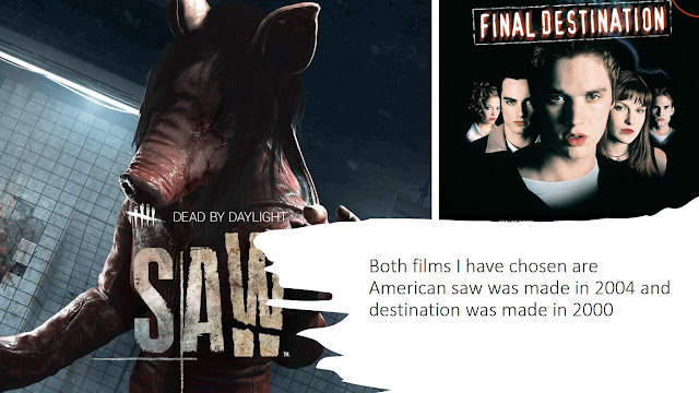
This power point is about 10 different horror movies who they where made by and how they where advertised I the chose 5 and went into more detail I also used a movie that wasn't from America to show the difference in how different media in different countries is displayed in movies.
P2 create a plan for a cross media advertising campaign in response to client brief
The scoring proposal
The scoring is a movie about a serial killer who kills his family and goes into hiding later on he comes back and continues to kill the movie is inspired by a serial killer called Ed Gean with a spin to create it to a more horror film. The movie will be 18 rated because of the contents on the movie such as language gore. The movies text on advertising will be sans text which will give it a more horror look and the colour scheme is black and red and will use different types of marketing for example. The Film is called The Scoring because the killer tallies his kills by tattooing them onto his wrist like he is keeping score. The movie will be advertised through billboards social media/online advertisements and clothing. The purpose of the film is to entertain people with the horror and the gore the sole purpose is to entertain and scare.
The poster for the film is a black background with an image which i have edited in Photoshop to make it red as well as adding a slight red gradient to the background to make it less harsh and so the text can blend more. The main text will be a sans wont which i will use the liquefy tool in Photoshop to make it look like blood drops coming from the text which will say The Scoring the text will be red and will be a big size to stick out and catch attention.
The movie will be advertised online through platforms such as Instagram twitter and YouTube and twitch ads this will get a lot of attention because the majority of the population uses at least one of these apps so this will be the main source of advertising but there will also be other sources like billboards this will cost to do but will be the second biggest source of advertising and will be worth the price to advertise the product the other way will be for fans to support the product while also advertising it which will be clothing this will also cost money but not as much as the billboards and will make profit as well as advertising when fans where the clothing we will make t-shirts and hoodies.
Aims and objectives of of advertising
The aims and objectives of advertisement is to bring in attention and engagement of audiences there are strategies to advertising for example if you have a niche audience you will advertise to them by making your advertisement interesting to them. You can also advertise to a main stream audience which you would have to appeal to everyone. The advertisement will help but it will be quiet predictable.
Target Audience
My target audience is 18 and older males this is because my movie is very gory and horror based my movie is not aimed at children because of the gore it will be a very violent and scary movie and will be advertised that way because it needs to be advertised to right.
M1 Evaluate different cross media advertising cross media advertising campaigns for consistency of message
These are the five movie campaigns that i have selected to look at more in depth these are the movies that are.
P3 create a pre production plan for the media components in the planned advertising campaign
These are my three top images I took out of my 15 because these are the scariest ones I made them more scary in these images i used techniques such as a green screen to make it easier to Photoshop as well as using lighting techniques and objects to emphasize the picture more to make it more horror film worthy
P3: create a pre production plan for the media
This is my photo shop text which has been edited in photoshop to make it look like ice this is because I used 3 different coloured writing and then I blended them together to make it look like ice then I duplicated it and turned it upside down to make it a shadow this come in useful to my horror movie this is because it gave me the skills to make my poster.
P3
this is my poster design
This is my general design idea it was used as a sketch to keep an idea of what needs to be in the sketch I had a few different colour ideas I was deciding on either black and green black and yellow or black and red I chose black and red because it suited the theme of the movie theme more.
This is the challenge task where we had to create a article copy using In design and the different tools I used tools such filling text and using columns to help format out article. we also used sans serif and serif text to make a copy of the article we also used was a line to layout the format of the article and make the line thicker to make a small bold box for the images at the side to separate them because they are other stories have made a big mistake in the image above by making it 5 columns under the first image instead of 4.
M2 justify the choice of planned components by targeted media sector
The conventions of a movie poster often usually character posters which features the main character in the poster the other type is iconic posters short and major conventions. this is used often in the movies I have studied such as the purge election year as well as predator is a character poster as it features the main characters in the poster where as in a poster such as the conjuring this features an iconic tree from the movie so it is an iconic convention.
This links to my horror film because I chose to do a character convention this is shown in my poster because the main character which is the person in my primary photographs is the main character and the poster is focused on him. that is also link to my movie proposal because their is one murderer alone which make sense for me to go with the character convention to make sure it advertises the movie correctly because people will see who the character is and will catch my target audiences eye. the codes of movie posters are to make sure all the regulations for your movie are on it as well with the necessary information for example because my movies genre is horror and has a lot of gore I will need to make sure it has the age rating easily seen on the poster and to make sure it advertises to the correct target audience which is why the colour scheme is black and red.
As well as the release date to make sure people know when it is. I also made my teaser poster very similar but without the information because that would lead to leaks because the teaser is used to create tension and hype up the audience so that the advertisements will make the movie more popular. i used a sans text font on my poster as it is better for the theme and genre my movie and is simple but is affective this is because it doesn't have any little flicks and is bold which is good because it goes better in the colour scheme and is stands out. The person in the adverts will be the main character this is because I am trying to get the audience familiar with the main character before the movie because it makes more scene because the character is always part of every scene I also use different camera techniques when I took the photographs which helps the characters representation because it makes him more scary which suits the movies genre which is horror. the font size is quite big because it makes the text stand out more and makes it more likely to be seen which spreads the name more and it is also red which suits the colour scheme of the rest of the poster.
The positing of the main character is right in the middle of the poster because it makes the poster stand out more and helps my goal of making the audience know the character before the movie. and the text portioning is to the side of the character and in its own space so it doesn't overlap \anything to make it easier to see the title and also not over the main character so it helps the advertisement of the movie more. The advert is supposed to feel scary and add tension to the person this helps my goals of making the movie very scary and gory this movie is hardcore horror so the poster needs to feel the same way to build tension and make audiences more excited and attract a larger audience.
collage
This is some of my best primary photos i have taken I made these into a collage when I was deciding which primary photo I wanted to use for my poster. In these pictures I have used different lighting in these photos also used the green screen to cut out the background. So that I can add filters in photo
M3 explain how the created media components comply with the codes and conventions of the media sectors
The codes and conventions of a movie poster often usually character posters which features the main character in the poster the other type is iconic posters short and major conventions. One of the code and conventions is attention is poster must be able to grab attention and gain an audience's attention. The poster also has to have text that tells the audience key information such as the date of release the age rating and stuff like that and it is usually smaller text so it doesn't take up to much of the poster. I have added photo techniques such as lighting and editing the main character against a green screen to edit the image in photoshop and it more scary. I have also used the colour scheme to make it more scary by making it stand out more by making it black and red and making it suit the genre.
P4
Instagram post
This is a teaser of the poster when it was not finished but this will be posted to help marketing strategies this is the same poster that will be used in magazines to promote my product this is a not full version of the poster and will be used as a teaser so it wouldn't disclose information about the movie such as the release date and other important information.
This is my movies poster design I have used a filter on the main image to make it this the reason I chose the black and red colour way is to make it more scary and to suit the horror theme I initially thought to use black and yellow but after I made a sample it gave off to much of a thriller theme and this movie is made only to scare people.


.JPG)


